Skip to content
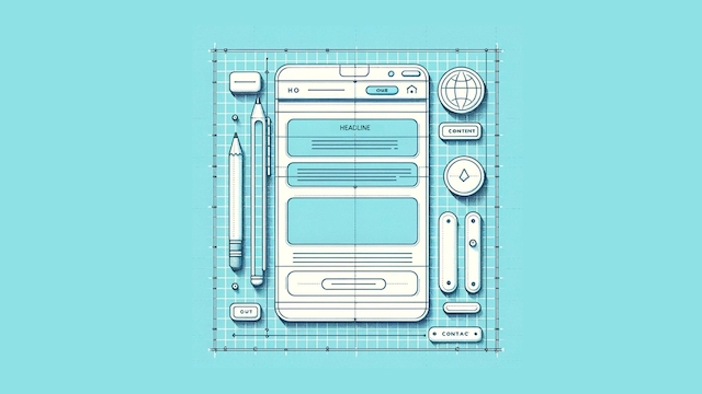
Think about the last time you came across a stunning website.
Crisp visuals…
Super easy navigation…
Flawless design.
But after a few seconds of admiring the aesthetics, you find yourself leaving.
This happens more often than you think.
A visually impressive website doesn’t guarantee sales.
Sure, it grabs attention.
But if you fail to connect with your visitors on a deeper level, it’ll leave them feeling lost.
At that point, you can kiss your ideal conversion rate goodbye.
Now, let’s flip the script
Imagine landing on a different website.
This time, it’s a single, focused page.
It might not have all the bells and whistles…
But it has everything that you need.
A clear message.
A compelling offer.
A reason for you to be there.
Within seconds, you understand what this page is all about.
And suddenly, you feel a certain pull to click that “Book now” button.
Wait, what just happened there?
It all comes down to the landing page.
It’s a single, clear-cut page designed to:
- Grab attention
- Explain the value
- And push visitors towards a specific action.
They’re like those “but wait, there’s more” infomercials that were popular in the 90s.
They keep you hooked by revealing one offer after another until you finally jump the gun and buy.
And the good news is, building a landing page that converts isn’t magic (although it might feel like it sometimes).
Anatomy of a perfect landing page
Whether it’s signing up for an email list or buying something, landing pages are meant to drive visitors to act.
People should be able to answer these questions as they scroll down the page:
- Why should I care?
- What should I do next?
Here’s the breakdown of the important parts of a landing page, from top to bottom.
Begin with a sexy headline in the hero section
This is the first thing visitors see on your landing page, so make it count.
Your headline should be like a sexy pick-up line that’s relatable to its intended audience.

It needs to make visitors curious.
Make it clear, catchy, and compelling.
Ditch the boring stuff and focus on what they really want.
What do they desire? What’s the end result they want?
I recommend creating a persona to understand this:
Find a powerful hero visual
Generic stock photos are the wallpaper of the internet.
They’re boring and forgettable.
So why would you use them for your landing page?
Your hero image or video needs to be the Beyoncé of visuals.
It stops the scroll, grabs attention, and makes visitors say “whoa”

In a heartbeat, it should tell people what you’re all about.
And it should leave them itching to learn more.

Use more human images that capture emotion so that you can relate to the audience and their desired state.
An independent study from Highrise claimed a 47% increase in paid signups using more person-centred images:

Even better, play around with videos.
They’re a fantastic way to break down complex concepts in a clear and engaging way.
Convert with an irresistible value proposition
Here’s the thing: people are bombarded with messages all day long.
On top of that, they can also smell a sales pitch from a mile away.
This is where your unique value proposition comes in.
We’re not talking about a “we’re the best” kind of brag session.
Think more along the lines of something sharp, witty, and so darn irresistible.
So, the question becomes: what makes you different?
What sets you apart from the sea of “me-toos” out there?
Now’s your chance to show visitors why they should choose you.

Communicate the right benefits and features
Don’t just tell visitors what you have – explain why it matters.
Answer the question “What will I get out of this?”.
It all starts with understanding who you’re trying to reach.
What are their pain points?
What else do they need?
What do they really desire from your product or service (end result)?
Even better, what gets them out of bed in the morning?
Once you know them, you’ll know how to speak to them.
And once you know their language, you can create messaging that will hit them where it matters.

When you brag, it backfires
Those trophies in your parents’ basement…
Totally cool but what value do they truly add to your life right now?
Listing every single product feature can distract people from what’s important.
Instead, translate features into benefits and show how they can improve their lives.
Let others do the talking with some social proof
We’re hard-wired to trust other people’s opinions..
If a majority of people have positive opinions about a product or service, you’re more likely to try it.
This is called the bandwagon effect.
You can use this to your advantage when you design your landing page.

Showcase reviews from happy customers who are singing you praises.
Even better, use video testimonials that literally and figuratively speak to your visitors.
To make your brand feel more legit, splash on logos of other brands that you partner with (after getting their buy-in, that is).
When people see this on your landing page, it’ll feel as if they’re getting recommendations from a friend.
Nielsen found that people were 77% more likely to buy a product if their friends recommended it.
Sprinkle call to action buttons everywhere
Many people make the mistake of adding too few CTAs across their landing pages.
Oftentimes, people don’t see them because they’re buried so far down the page.
My advice: sprinkle them everywhere.
Use strong statements and dangle that carrot right on their faces.
“Start your free trial”
“Download now”
“Buy now”
The clearer you are, the more likely they’ll click that button.
A little FOMO can also be a powerful motivator.
Create a sense of urgency and get them to jump on the bandwagon to get them to convert before it’s too late.

Don’t make them jump through hoops
Be honest, how many buttons are you willing to push just so you can download that free ebook?
Too many barriers will turn people away.
Shorten the experience with short and sweet forms.
Keep it short and sweet.
Only ask for the information you absolutely need – name, email, maybe a phone number.
But be careful of phone numbers…
WPForms explains that 37% of people will abandon a form that requires a phone number.
And make sure that you use clear labels to show what’s what.

Don’t derail conversions with these rookie mistakes
Now you know how to put your landing page together part by part.
Next, let’s talk about making them deliver impact.
Avoid these rookie mistakes that’ll send your conversion rate plummeting faster than you can say “bounce rate”.
With the right moves, you’ll be able to create landing pages that convert like crazy – all without burning a hole in your wallet.

Mistake #1 – you didn’t hook them fast enough
Our attention spans have dipped by 103 seconds since 2004.
I’d argue it’s less than 3 seconds nowadays.
That’s all it takes for people to decide if you’re worth their time.
This said, you need to grab their attention before they click elsewhere.
Imagine your landing page is a printed newspaper.
In the old days (cue nostalgic music), newspapers were folded in half when displayed at newsstands.
That top half is the “above-the-fold” section.
On landing pages, above the fold refers to what people see without scrolling down.
It’s prime real estate – and you should treat it like gold.
Mistake #2 – you use boring stock photos
Let’s face it, nobody gets excited by generic stock photos.
Your landing page needs images and videos that pop and tell a story.
Even better, they should make people feel something.

Mistake #3 – you speak an alien language
Imagine trying to order coffee in a foreign country.
You point at random words on the menu and hope that you’ll get something you’ll like.
Confusing, right?
The same goes for landing pages — especially those with one-size-fits-all messages.
Your audience won’t understand what you’re offering, much more get excited by it.
Generic copy, jargon, and technical terms scare people away.
Even worse, they don’t help the audience understand how you can help them.

Mistake #4 – you’re not convincing enough
Trust issues, anyone?
Telling visitors how great you are isn’t enough.
People are afraid of scams and unreliable products.
Because of this, you need sophisticated ways to demonstrate your power and impact.
And the good news is… building credibility and trust isn’t exactly rocket science (but it is a science).
Mistake #5 – your CTA is… lame (sorry, not sorry)
It’s that moment where people decide to take the plunge.
So you need a CTA that will make them want to do just that.
A lame CTA is like inviting someone to a party and offering them lukewarm water.
They’ll politely decline and head next door where the real fun is.
“Learn More”? Yawn.
“Submit”? No thanks.
Use powerful words that will inspire them to take action.
And use the right colors that get them to click that button.

Now, let’s go beyond the basics
So you’ve designed the parts of your landing page to deliver maximum impact.
But there’s always room for a bit more awesomeness.
Here are some landing page secrets (well, not anymore) that’ll have visitors falling in love with your brand:
Think about tiny screens
Use responsive designs for landing pages that work flawlessly on any device.
No more zooming disasters or tiny text.
Just happy (and clicking) visitors.
Take time to A/B test
Have a friendly competition between different versions of your page.
Try out different combos of headlines, buttons, pictures.
Test out different versions to see which one gets the most people taking action.

Are visitors clicking where you want them to?
Are they getting stuck anywhere?
This intel is gold – use it to optimise your landing page and make it the ultimate conversion machine.
Let data spill the tea
Heatmaps and analytics will help you see here people click, scroll, and maybe even rage quit.
Are they getting stuck on anything?
Clicking where you want them to?
Use these info to fix the confusing bits and carefully guide viewers to where they should go.
I recommend using tools like:
- Hotjar
- Microsoft Clarity
- And Crazy Egg by my good friend Neil Patel
So the question is… will they click through or click away?
By avoiding these mistakes as you design your landing page, you’re ready to make your visitors do a happy dance (or at least hit that sweet “sign up” button).
Landing pages might seem small – but they’re the real 24/7 salespeople for your business.
Again, here’s a quick check list of the anatomy of a perfect landing page:
- A powerful hook that will catch their attention
- Visuals that hit the right emotional states
- Crystal-clear messages that showcase your value (without being salesy)
- Social proof that speak for your brand (using psychological biases)
- Many call to action buttons that’re more tempting than a slice of warm apple pie à la mode (yum)
Follow these tips and turn clicks into conversions — and don’t stop with just one page.
Turns out, you have more chances of winning if you have more pages (30 seems to be the magic number).